Analytics Overview
The Cheetah Digital Loyalty Marketing Console enables marketers to access their consumer transactional data and provides for analytical insights. Marketers can access and extract data using Analytic Queries that can be configured into customizable charts within the Dashboards Panels and Dashboard KPI Tiles.
Analytics Features
Analytic Queries
A query is an inquiry into the database using the SELECT statement. It is used to extract data from the database in a readable format according to the user’s request. Analytics Queries will first be defined by creating and saving a Query String to execute against the Cheetah Digital Loyalty Big Data Server.
The Cheetah Digital Loyalty Marketing Console allows for 3 ways to perform Analytic Queries – Phoenix, SQL, and Spark. Different Analytic Queries are used depending on how the consumer transactional data is stored.
Dashboards
Dashboards are pages that contains a series of Panels and KPI Tiles to visualize meaningful KPIs or data about your Loyalty Program. Query Strings that were created and saved can then be mapped to Panels and KPI Tiles to display the data in the form of charts. These charts reflect analytical insights and feedback that marketers require.
New Dashboards can be implemented either by creating new Dashboards or editing current Dashboards. Chart Types within the Dashboard can also be customized.
KPIs
KPIs are calculated, single attributes that are stored for the purpose of delivering summary analytics. Cheetah Digital Loyalty uses KPI concepts, such as Member KPIs and Program KPIs, for marketers to see and track.
Examples of Member KPIs include “Member Profitability Index”, “Member Loyalty Index”, and “Member Lifetime Value”.
Examples of Program KPIs include “New Member Count”, “Active Member Count”, “Total Member”, “Basket Size” (count of items per purchase), “Basket Value” (spending per purchase), “Total Spend” (spending per member), “Activity Per Member”, etc.
Creating a Query for Dashboard Panels
This section will provide the entire workflow of creating a query on the marketing console. This use case example will highlight the creation of a query to track Member and Non-member Revenue in the Last 4 Months. You need to first define a query by creating and saving a query string to execute against the Cheetah Digital Loyalty Big Data Server. This query will need to extract Revenue data for Members and Non-members.
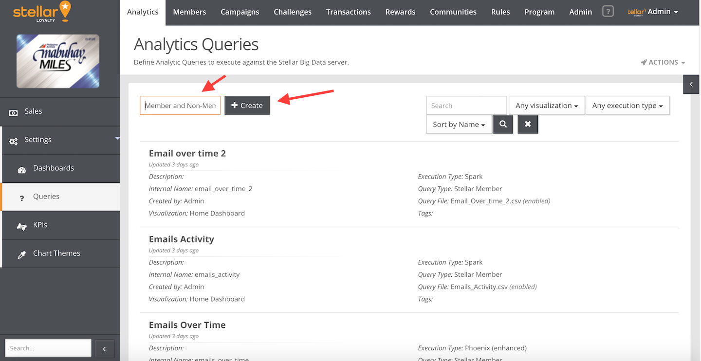
- Go to Analytics > Settings > Queries
- Enter “Member and Non-Member Revenue” as a display name. Click the Create button.
- Specify the labels of the Query:
- Description. Enter a description about the query. Eg. “Revenue by membership” (Optional).
- Visualization. Select “Home Dashboard” for the query to be mapped into Dashboards.
- Execution Type. Select “Phoenix (enhanced)”. Phoenix is used to perform analytic queries for extracting revenue data from the Activity Table.
- Query Type. Select the default “Cheetah Digital Loyalty Member”.
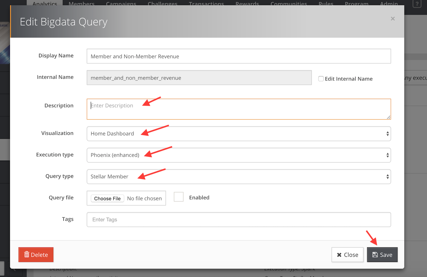
- Click the Save button.
- Click the “Member and Non-Member Revenue” Query, which would now appear in the list of Queries.
- Click the Edit button in the top right hand corner of the “Query String (Phoenix (enhanced))” box.
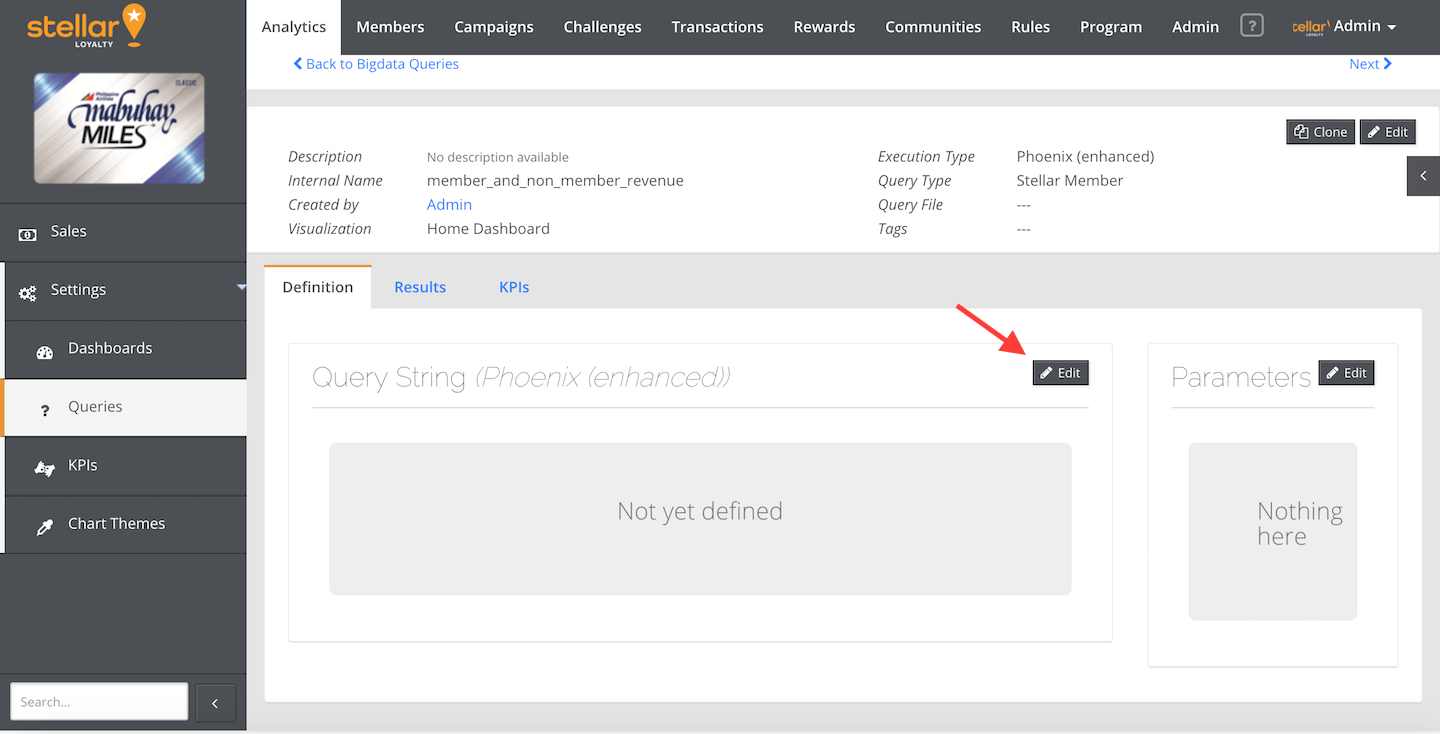
- Enter the following Phoenix Query String:
SELECT
TO_CHAR (sl_activity_ts,'MM/yyyy') AS MONTH,
SUM(CASE WHEN sl_member_id IS NULL or SL_MEMBER_ID = '' THEN sl_total ELSE 0 END) AS "Non-Member",
SUM(CASE WHEN NOT(sl_member_id IS NULL) THEN sl_total ELSE 0 END) AS "Member"
      FROM ACTIVITY_TABLE
      WHERE sl_type = 'sl_purchase'
      AND   in_period(sl_activity_ts,'PERIOD') = TRUE
      GROUP BY MONTH
ORDER BY MONTH
This query sums the column values of sl_total to generate the total revenue for both Members and Non-members.
Non-member values are obtained using the condition:
CASE WHEN sl_member_id IS NULL or SL_MEMBER_ID = ''
Non-member values are obtained using the condition:
CASE WHEN NOT(sl_member_id IS NULL).
Condition is set as such to extract all purchase data to calculate revenue:
sl_type = 'sl_purchase'
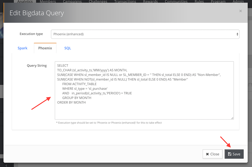
- Click the Save button.
- Click the Edit button in the top right hand corner of the “Parameters” box.
- Click Add Parameter:
- Key. Enter “PERIOD”
- Default. Enter “last4m” (For the last 4 months)
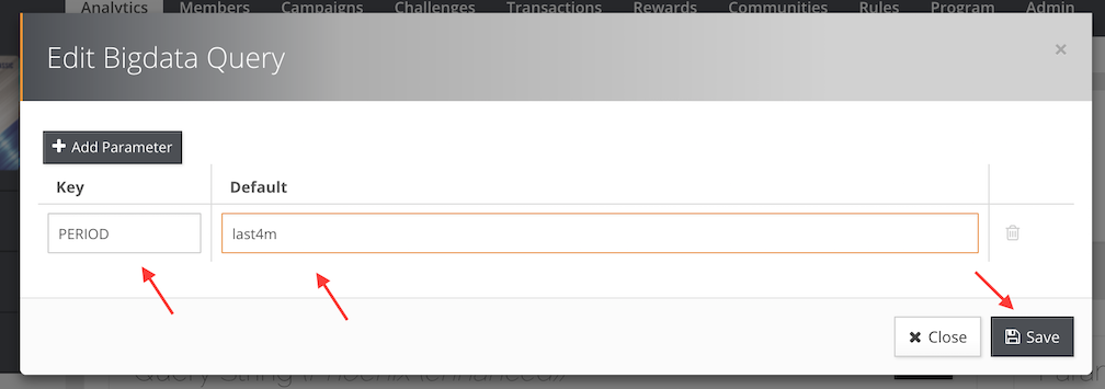
- Click the Save button.
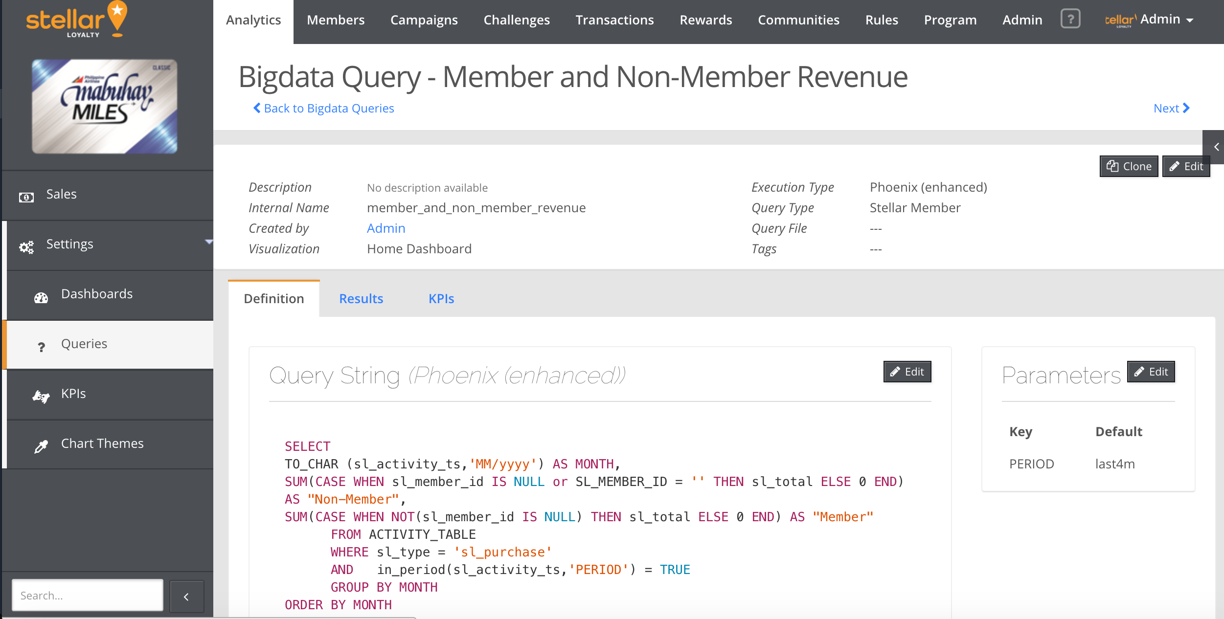
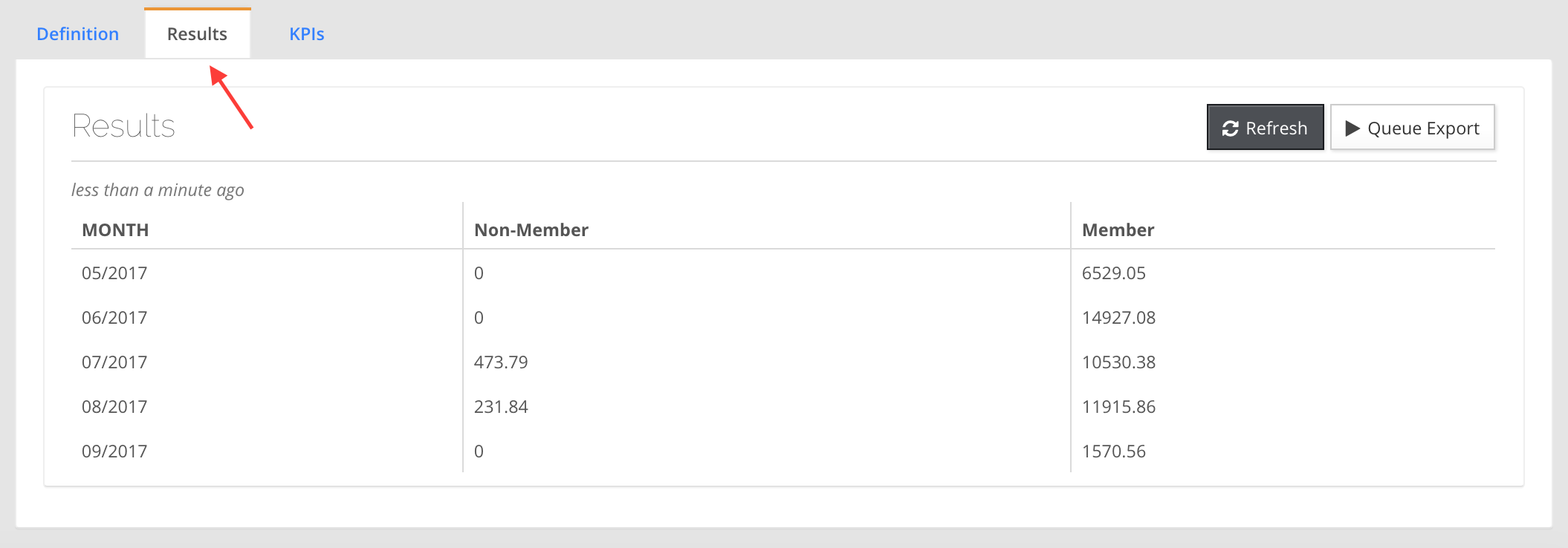
- Click the Results tab to view your result table from the Query. Your Query for the Dashboard Panel is ready for use.
Creating a Query for KPI Tiles
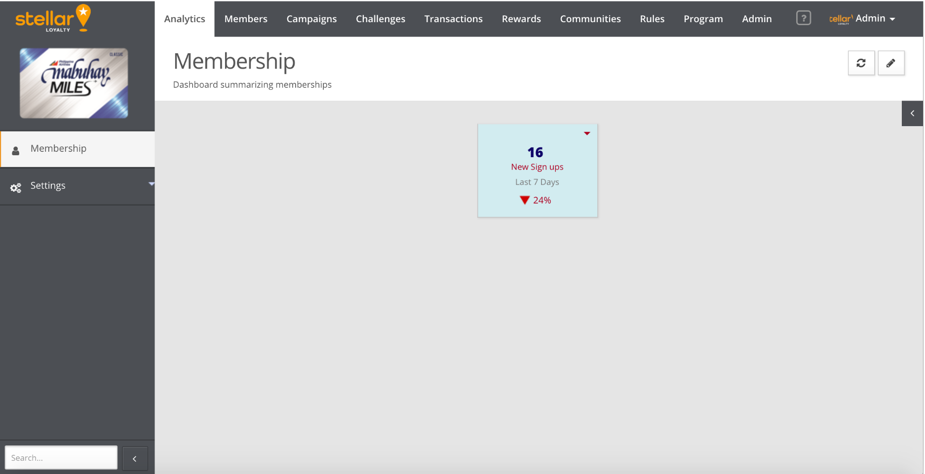
Queries for KPI Tiles and Dashboard Panels with KPIs require additional steps to be done after inputing the query and parameters. This use case example will use the query for a KPI Tile to track New Member Sign-ups in the Last 7 Days as shown below:
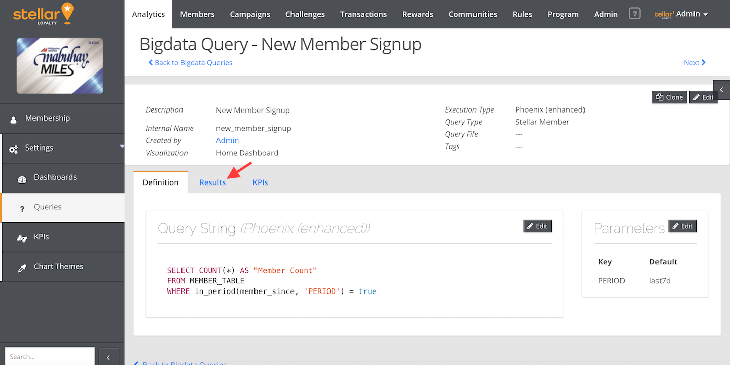

The initial steps for the creating of queries for KPI Tiles are the same as those of Dashboard Panels (Steps 1 to 12 in the previous section).
- After creating the query, click the KPIs tab.
- Click the Edit button at the top right hand corner of the KPIs box.

- Click Add KPI.
- Select the Column Key: “Member Count”
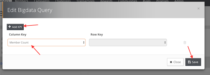
- Click the Save button.

Creating a Dashboard
This section will provide the entire workflow of creating a Dashboard on the marketing console. There first needs to be a Dashboard for both Dashboard Panels and KPI Tiles to be contained in. This use case example will highlight the creation of a “Sales” Dashboard.
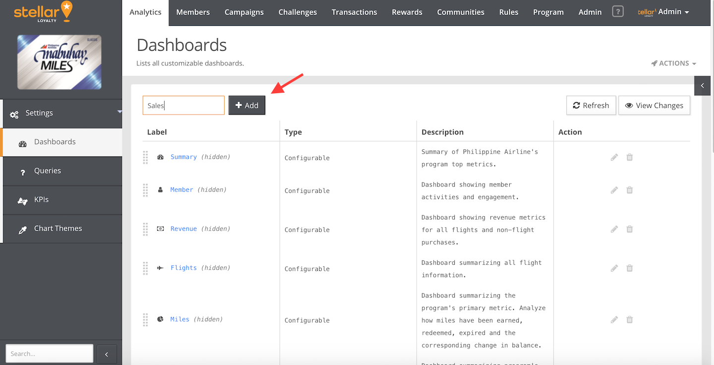
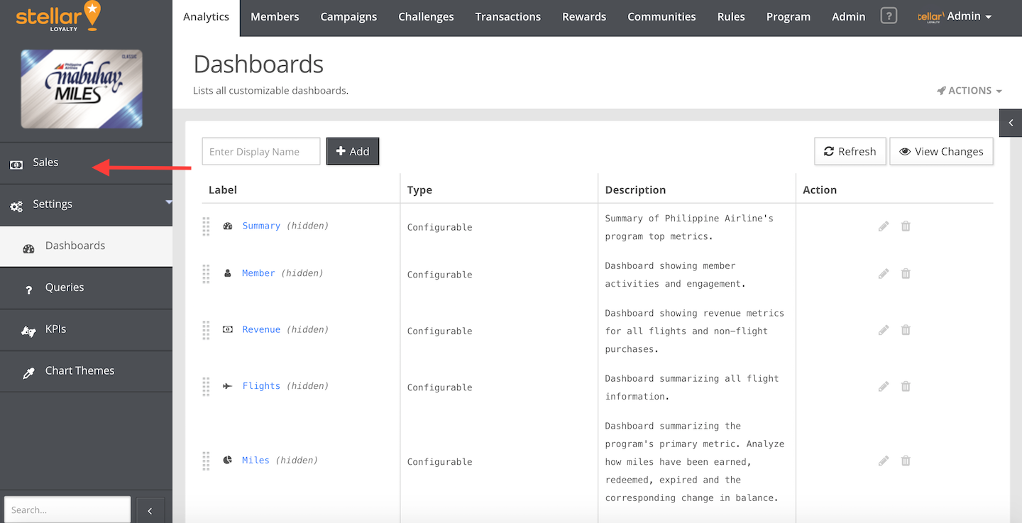
- Go to the Marketing Console. Go to Analytics > Settings > Dashboards.
- Enter “Sales” as a display name. Click the Add button.
- Specify the labels of the dashboard:
- Description. Enter a description about the Dashboard. Eg. “Dashboard summarizing sales”(Optional).
- Visible. Check the box in order for the dashboard to be displayed on the left sidebar.
- Icon. Select an icon to display on the left sidebar. For sales, typically a “money” icon would be selected (Optional)
- Type. Select “Configurable” to enable editing of the Dashboard.
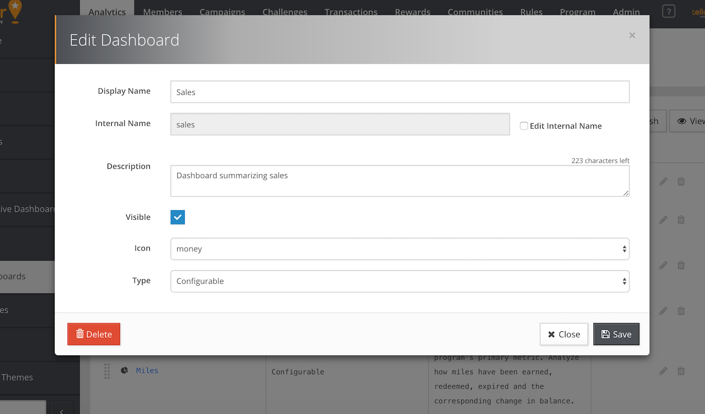
- Click the Save button. The “Sales” Dashboard would now be visible on the left sidebar. (You may need to refresh the browser.)
Creating a Dashboard Panel
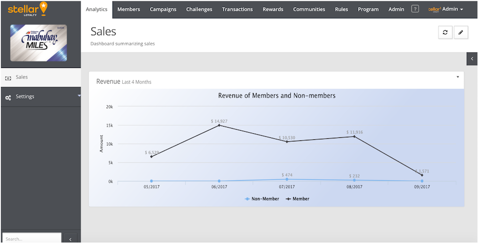
This section will provide the entire workflow of creating a Dashboard Panel on the marketing console. This use case example will highlight the creation of a Dashboard Panel to track Member and Non-member Revenue in the Last 4 Months in a Series Chart. This Dashboard Panel would be implemented onto a “Sales” Dashboard.
- Go to Analytics > Sales
- Click the Pencil icon at the top right hand corner of the page.
- Click the Add Panel button.
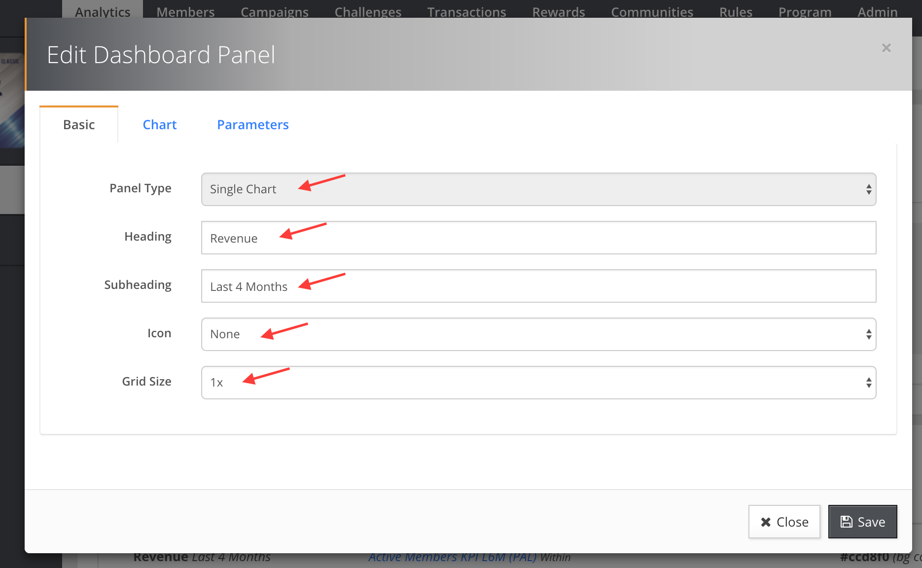
- On the Basic tab, specify the labels:
- Panel Type. Select the default option “Single Chart”
- Heading. Enter “Revenue”
- Subheading. Enter “Last 4 Months”
- Icon. Optionally select an icon.
- Grid Size. Select “1x”
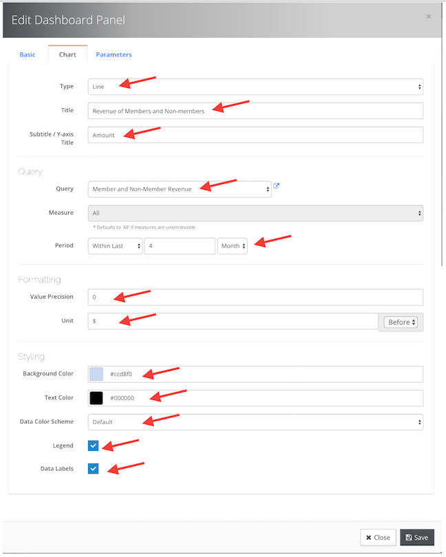
- Click the Chart tab, specify the labels:
- Type. Select the default option “Line”.
- Title. Enter “Revenue of Members and Non-members”.
- Subtitle. Enter “Amount”
- Query. Select the query “Member and Non-Member Revenue” from the dropdown box.
- Period. Select “Within Last”, enter “4”, select “Month”.
- Value Precision. Select the default option “0”.
- Unit. Enter “$”.
- Background Color. Select “#ccd8f0”
- Text Color. Select “#000000”
- Data Color Scheme. Select the default option “Default”.
- Check the box “Legend” and “Data Labels”.
- Click the Save button.
- The new Dashboard Panel “Revenue” would be added to the list of panels.
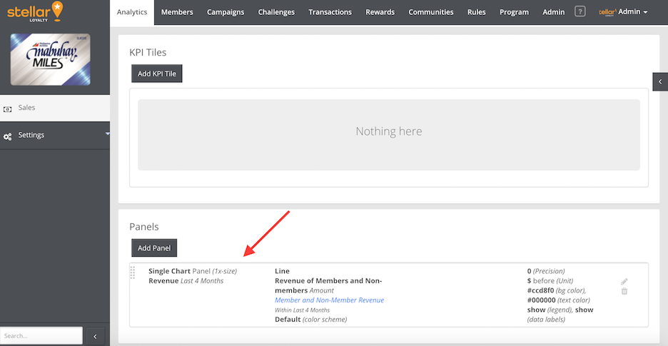
- Go to Analytics > Sales. The new Dashboard Panel “Revenue” would be visible on the Sales Dashboard in the form of a series chart.
Creating a KPI Tile
This section will provide the entire workflow of creating a KPI Tile on the marketing console. This use case example will highlight the creation of a KPI Tile to track New Member Sign-ups in the Last 7 Days with a percentage comparison to the Previous 7 Days. This KPI Tile will be implemented onto a “Membership” Dashboard.
- Go to Analytics > Membership
- Click the Pencil icon at the top right hand corner of the page.
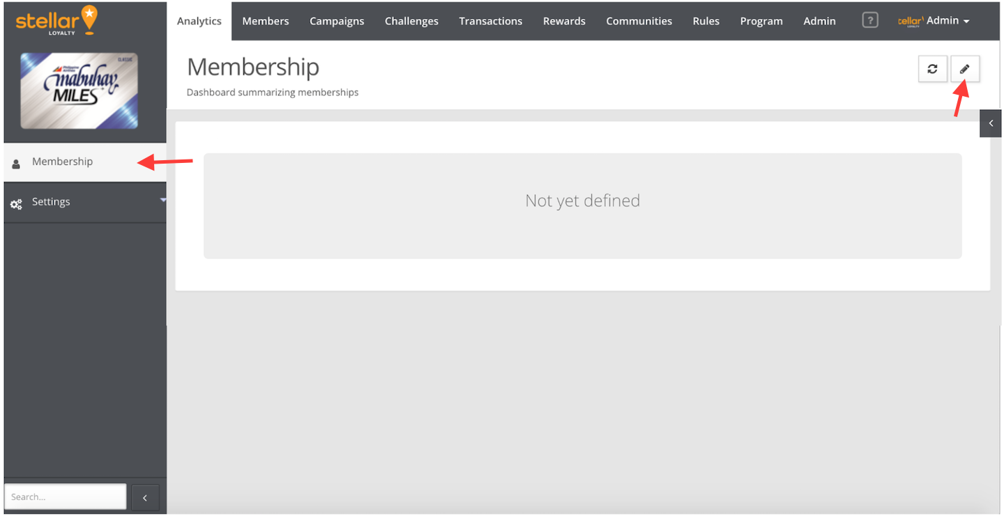
- Click the Add KPI Tile button.
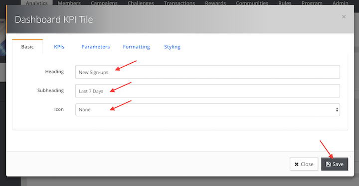
- On the Basic tab, specify the labels:
- Heading. Enter “New Sign-ups”
- Subheading. Enter “Last 7 Days”
- Icon. Optionally select an icon.
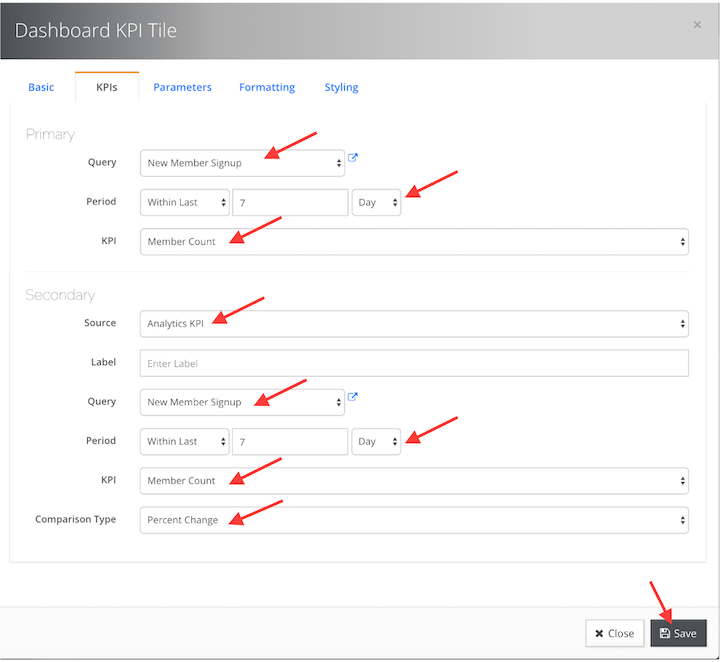
- Click the KPIs tab, specify the labels:
- Query. Select the query “New Member Signup” from the dropdown box.
- Period. Select “Within Last”, enter “7”, select “Day”.
- KPI. Select the Default “Member Count”.
- Secondary: Source. Select “Analytics KPI”
- Secondary: Query. Select the same query “New Member Signup” from the dropdown box.
- Secondary: Period. Select “Within Previous”, enter “7”, select “Day”.
- Secondary: KPI. Select the Default “Member Count”.
- Secondary: Comparison Type. Select “Percent Change”
- Click the Styling tab, specify the labels:
- Background Color. Select “#d3ecf0”
- Text Color. Select “#ab0022”
- KPI Color. Select “#0e0066”
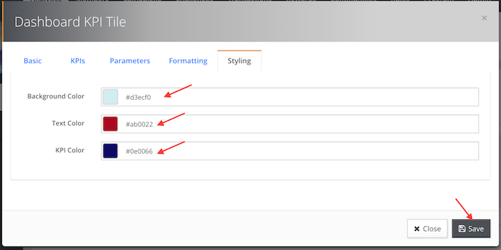
- Click the Save button.
- The new KPI Tile “New Sign-ups” would be added to the list of KPI Tiles.
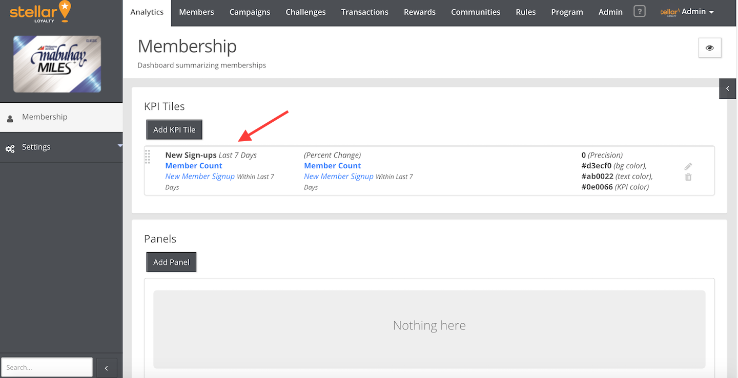
- Go to Analytics > Membership. The new KPI Tile “New Sign-ups”, with the percentage change from the previous 7 days, would be visible on the Membership Dashboard.
