 Working with Chart Views
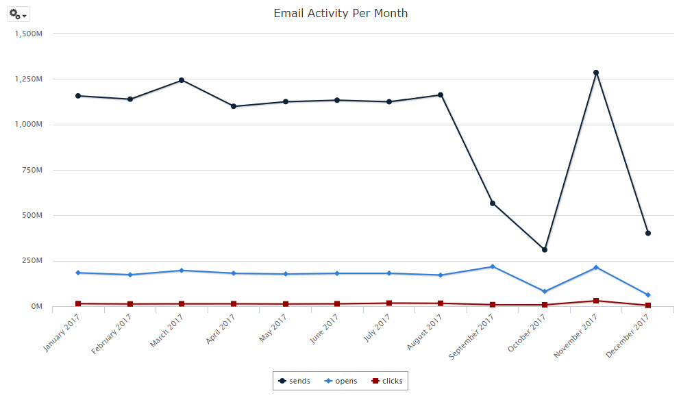
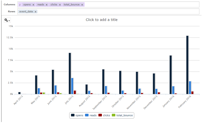
Charts, such as bar graphs, line graphs, and pie graphs, are used to summarize and present data graphically. Within the Marketing Intelligence Report Manager, you can choose from a wide range of chart types, define different levels of aggregation for rows and columns, and zoom in to see chart details. For example, the following line graph plots the quantity of email sends, opens, and clicks over time:
Working with Table Views |
|
|
|
|
|
|
|
|
|
|
|
|
|
|
|
 Select Chart Type
Marketing Intelligence supports a wide range of Chart Types, such as bar graphs, spline graphs, and pie charts. You can easily switch between different chart types in order to select the charting method that presents your information in the clearest manner. For example, if you're trying to present various how different quantities represent a percentage of a whole, then you may want to use a pie chart. If you're trying to depict trends over time, then you may want a spline graph.
To select the chart type:
Mouse-over the options menu (gear icon) in the top-left corner of the Workspace.
From the drop-down menu, select "Select Chart Type." The "Select Chart Type" pop-up window is displayed.
Click on the desired chart type. The system redraws the chart within the Workspace. Repeat this step as needed to view different chart types.
When finished, click the close button ("X" icon) to close the "Select Chart Type" pop-up window.
 Define
the Columns and Rows
Define
the Columns and Rows
When building a Chart View, the concept of Columns and Rows refers to how the data underlying the chart is organized. Columns correspond to the data series in the chart; Rows map to categories, or groups, along the X-axis of the chart.
For example, let's say you want to create a column chart that shows the number of email opens, reads, clicks, and bounces, per month. You would add those four measures as Columns in the chart. Then you would add the date field as a Row, as this date represents how you want to group the four measures.
In this example, the user has added four measures (opens, reads, clicks, and bounces) as the Columns in a column chart. These four measures correspond to the four different columns depicted in the graph.
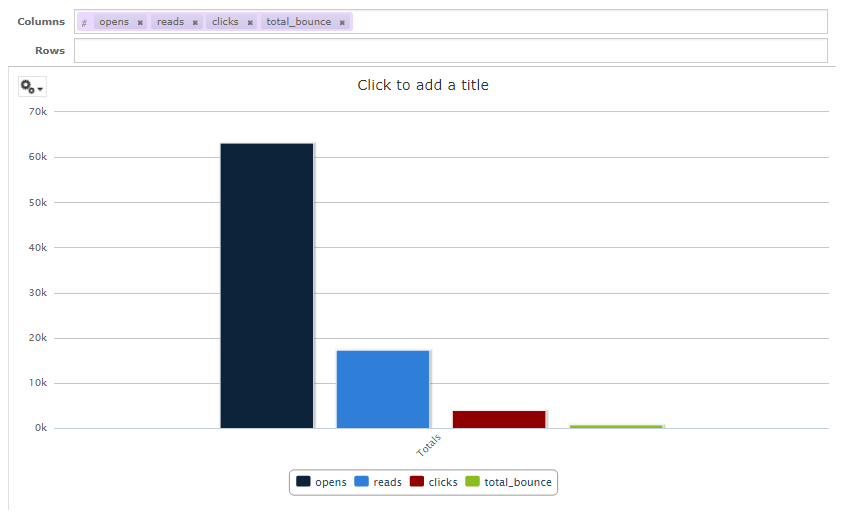
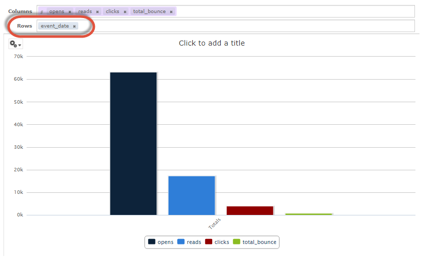
Next, the user wants to group the four measures together by date, so she adds 'event_date' as a Row. However, you'll notice that the chart hasn't changed; by default, the system has aggregated all dates together into a single grand total, across all dates.
The user has to "drill into" the date field, and adjust the level of detail. The "Data Level" sliders within the "Filters" pane allow her to adjust the detail level for a field. If she slides this slider for the 'event_date' field, the system redraws the chart, and shows the four measures for every date value.
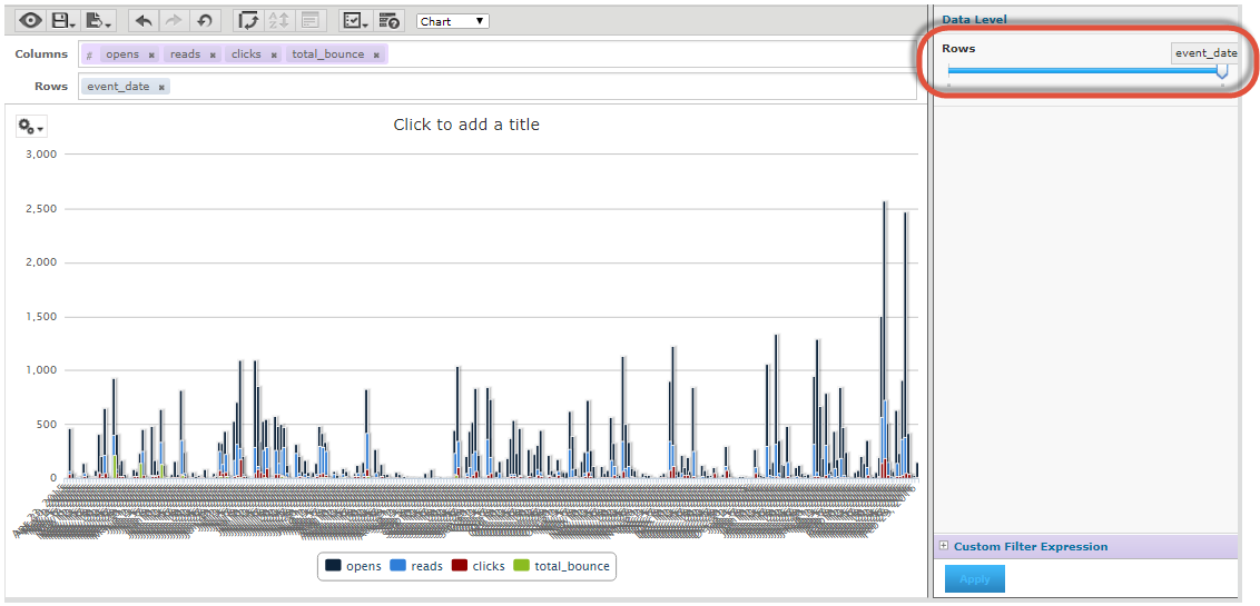
Unfortunately, this chart is unreadable because of the high number of discrete date values. The user needs to change the aggregation level for the event date field, to display the dates grouped together by month, or perhaps by quarter. Within the Layout Band, she right-clicks on "event_date" and selects Change Group > Month from the contextual menu, which greatly improves the presentation and readability of the chart.
You must add at least one measure to a Chart View. Before any measures are added to the chart, the Ad Hoc Editor displays a message reading: "Add a measure to continue." As you add measures, the Editor displays the grand total of each measure in the chart.
Fields can be added as either Rows or Columns.
Measures contain summarized values. They are typically numeric fields that determine the length of bars, the size of pie slices, the location of points (in line charts), or the height of areas, for example. Measures can be added as either Rows or Columns, but they must all be in the same group -- that is, you can add one or more measures to the chart as Columns, or add one or more measures to the chart as Rows, but you can't have one measure as a Column and another as a Row within the same Chart View.
The Workspace reflects the measures you add; it doesn't change when you add fields. For example, for each measure you add to a bar graph, you see a bar with the total value of the measure, regardless of how many fields you add.
When creating a chart, keep in mind that Row and Column groups are arranged in hierarchies, with the highest member of the hierarchy on the left. This hierarchy controls various aspects of the chart, such as the position of the measures in a column chart, or the X- and Y-axis in a scatter chart.
To define the Columns or Rows in a Chart View:
From either the "Fields" or the "Measures" pane, drag the desired item, and drop it into either the "Columns" field or the "Rows" field in the Layout Band. If you added a measure, the system refreshes the Workspace, and populates it with sample data. Within the Layout Band, measures are displayed as purple boxes, and fields as gray boxes. You can also add an item by right-clicking on it in either the "Fields" or "Measures" pane, then selecting "Add as Column" or "Add as Row" from the contextual menu.
Optionally, to rearrange the Column or Row hierarchy, drag the item within the Layout Band, and drop it into its desired location.
Optionally, to remove a field or measure from the View, within the Layout Band, click the "X" icon next to the item name.
Depending on its data type, a field can optionally be turned into a measure. For example, you could use a date field as either a regular field or a measure.
To convert a field into a measure:
Within the "Fields" pane, right-click on the field, and select "Use as Measure." The system converts the field to a measure, and displays it within the "Measures" pane.
Conversely, to convert a measure into a field, within the "Measures" pane, right-click on the field, and select "Use as Field." The system converts the measure to a field, and displays it within the "Fields" pane
 Pivot
Columns and Rows
Pivot
Columns and Rows
The platform allows you to "pivot" an item, by switching it from a Row to a Column (or vice versa). Please note that all your measures must be in the same group -- either as Rows or Columns. Therefore, the system won't allow you to pivot a single measure if there are currently other measures in the Chart View. You can, however, pivot all of your measures at once.
To pivot a single item: such as a field, or the entire set of measures:
Drag an item, from its current location within the Layout Band, and drop it into its desired location. If you want to pivot the measures in your View, be sure to click on the larger shaded box that collects all of the measures together, rather than trying to click a single measure.
Right-click on an item's header label within the Workspace, and select "Switch to Column Group" (or "Switch to Row Group") from the contextual menu.
To pivot the entire View (all Rows become Columns, and all Columns become Rows), click the "Switch the groups" button in the Toolbar.
 Adjust
Date Aggregation
Adjust
Date Aggregation
If your Chart View includes a date field, you can adjust the level of aggregation for the time data. To select the unit of time to chart:
Within the Layout Band, right-click on the date field, and select "Change Grouping" from the contextual menu.
From the sub-menu, select the desired unit of time. The system redraws the chart within the Workspace.
 Create
a Calculated Field (or Measure)
Create
a Calculated Field (or Measure)
Calculated Fields are special fields whose values are mathematically derived. For example, you could derive a "Click Rate" field based on the number of clicks divided by the total number of messages sent, then add this Calculated Field to your Ad Hoc View.
The process for creating a Calculated Measure is essentially the same as described below for creating a Calculated Field, except you start by selecting a measure from the "Measures" pane.
To create a Calculated Field:
Mouse-over the options icon in the "Fields" pane, and select "Create Calculated Field." The "New Calculated Field" pop-up window is displayed.
In the "Field Name" text field, enter a name for the new Calculated Field.
The "Formula" text field is used to build the formula for the Calculated Field. You can type within this field, or you can use the various options and controls in the pop-up window to build the formula. Within this field you can insert the following:
The buttons beneath the "Formula" field allow you to insert mathematical Operators. Position your cursor where you want to insert the symbol, then click the desired button. The system inserts this symbol into the "Formula" text field.
The "Fields and Measures" list box lists all of the fields and measures in this Ad Hoc View. Position your cursor where you want to insert the field or measure, then double-click the field or measure name. The system inserts this item into the "Formula" text field.
The "Functions" list box lists a wide range of SQL Functions. Optionally, to display the arguments within the formula, place a check mark in the "Show arguments in formula" check box. Position your cursor where you want to insert the field or measure, then double-click its name. The system inserts the SQL statement into the "Formula" text field.
Note: To see a description of a function, click on it; a description of the selected function is displayed within the "Function Description" area.
To validate the formula syntax, click validate. The validation results are displayed.
Optionally, to define an Aggregate Function, click the "Summary Calculation" tab. Select a calculation method from the "Calculation" drop-down menu.
Click create field. The new Calculated Field is displayed within the "Fields" pane. You can now add this Calculated Field to the Ad Hoc View, just as you would a regular field.
 Define
Filters
Define
Filters
Any Pre-Filters that you defined when setting up the View are displayed within the "Filters" pane on the right-hand side of the screen. Click on the plus-sign icon next to a filter to expand it to see the details of the filter logic. Optionally, if the filter hasn't been locked, you can modify the filter logic as follows:
To change the operator, click the drop-down menu next to the filter name, and select a different operator.
To change the value, enter or select the desired value.
To remove a filter from the View, select "Remove Filter" from the filter options drop-down menu to the right of the filter name.
If your view contains multiple filters, you can arrange the filters into the desired sequence. To move a filter, from the filter options drop-down menu to the right of the filter name, select "Move Up" or "Move Down." Repeat this step as needed to rearrange the filters.
At the bottom of the "Filters" pane, click apply.
To add a new filter to the View:
From either the "Fields" or the "Measures" pane, drag the desired item, and drop it into the Filter pane. You can also add a field to a filter by right-clicking on it in either the "Fields" or "Measures" pane, or in the Layout Band, then selecting "Create Filter" from the contextual menu.
From the drop-down menu, select the desired operator.
Select or enter the desired value.
At the bottom of the "Filters" pane, click apply.
 Edit the
Chart View Look-and-Feel
Edit the
Chart View Look-and-Feel
The Ad Hoc View Editor provides a variety of tools for adjusting the presentation and the look-and-feel of your Chart View.
Data Point
Data Points refer to the "dots" displayed in certain chart types, such as line and spline charts. Each measure uses a different shape for the data point, such as squares, triangles, or diamonds. Data points can help users visualize the chart data more accurately.
To toggle the data points off:
Mouse-over the options menu (gear icon) in the top-left corner of the Workspace. From the drop-down menu, select "Chart Format." The "Chart Format" pop-up window is displayed.
Remove the check mark in the "Show data points" check box (the box is checked by default).
Click apply. The system redraws the chart within the Workspace.
Click close to close the "Chart Format" pop-up window.
Measure Name
By default, in charts that include only a single measure, that measure's name is not displayed within the chart. For instance, let's say you have a bar chart that uses the measure "clicks" as a Column. The number of clicks appears along the X-axis, but the name of the measure ("total_clicks" or similar) isn't displayed. You can, however, choose to display that measure name to clarify the information on your chart.
To toggle on the measure name:
Mouse-over the options menu (gear icon) in the top-left corner of the Workspace. From the drop-down menu, select "Chart Format." The "Chart Format" pop-up window is displayed.
Place a check mark in the "Show measure name on value axis" check box.
Click apply. The system redraws the chart within the Workspace.
Click close to close the "Chart Format" pop-up window.
Axis Labels
As you add or remove measures to a Chart View, the Ad Hoc Editor automatically scales the chart to fit in your browser window. For most chart types, such bar, column, and line charts, the system determines the appropriate increments to use along the axis. By default, the system displays labels next to each of these increments (referred to as "steps"). In order to improve the clarity in your chart, you can choose to display only certain labels, rather than every label.
You've created a bar chart showing the number of emails sent and opened for three different Campaigns. The system has selected a scale of 50 (50, 200, 150, 200, etc.), and displays the number next to each step.
In order to remove some visual clutter from the chart, you want to display the labels only for the "100" increments (100, 200, 300, etc.). You would adjust the chart format options to display every 2 steps, rather than every step.
To adjust which axis labels are displayed in the Chart View:
Mouse-over the options menu (gear icon) in the top-left corner of the Workspace. From the drop-down menu, select "Chart Format." The "Chart Format" pop-up window is displayed.
Optionally, to modify the X-axis labels, enter the desired increment in the "Steps to show X axis labels" text field. The default value is "1," meaning the system will show every label at every step.
Optionally, to modify the Y-axis labels, enter the desired increment in the "Steps to show Y axis labels" text field. The default value is "1," meaning the system will show every label at every step.
Click apply. The system redraws the chart within the Workspace.
Click close to close the "Chart Format" pop-up window.
In order to fit long text labels within the chart, the system may rotate the labels so they appear slanted. To adjust the rotation of the axis labels:
Mouse-over the options menu (gear icon) in the top-left corner of the Workspace. From the drop-down menu, select "Chart Format." The "Chart Format" pop-up window is displayed.
Optionally, to modify the X-axis labels, enter the desired degree of rotation in the "Degrees to rotate X axis labels" text field.
Optionally, to modify the Y-axis labels, enter the desired degree of rotation in the "Degrees to rotate Y axis labels" text field.
Click apply. The system redraws the chart within the Workspace.
Click close to close the "Chart Format" pop-up window.
Zooming
Within the Ad Hoc Editor, you can zoom in on a specified section of a Chart View. This feature is useful when the labels at the bottom of a chart are too difficult to read.
To zoom in on a section of a View:
Click-and-drag your cursor over the chart in the Workspace. As you are dragging, the system draws a blue rectangle over the selected area, indicating the section that you have selected.
Release your mouse button. The system redraws the chart within the Workspace to show only the section you highlighted.
To revert back to the full chart, click reset zoom.
Note: Zoom settings can't be saved as part of the Ad Hoc View or a Report. When you save an Ad Hoc View, or create a Report from a View, the zoom setting is automatically defined to show the entire chart.
Report Title
To define a report title:
Within the Workspace, click the "Click to add a title" text label. The label changes to an editable text field.
Enter the title of the report and press Enter.
Optionally, if you don't want the report title displayed:
Within the Toolbar, select the Page Options button (check mark icon), and select "Toggle the Title Bar" from the drop-down menu.
Back to Marketing Intelligence Report Manager