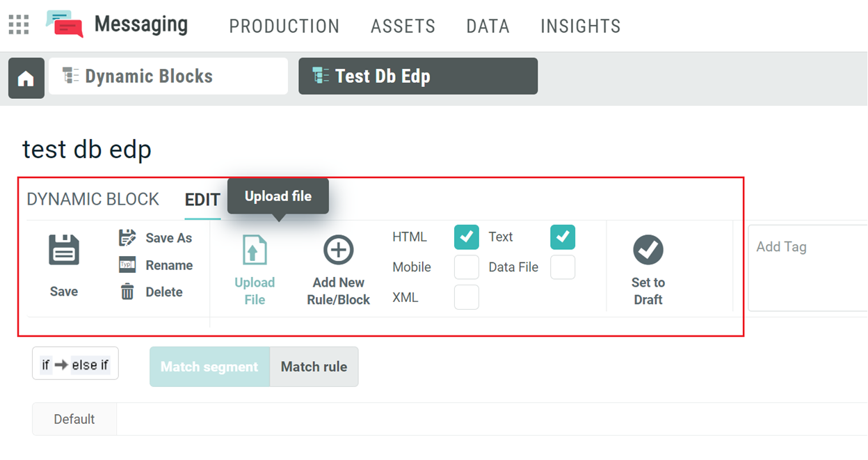
 System Navigation
App Switcher
If you use multiple Marigold applications, you can move seamlessly between these different apps via the app switcher in the top-left corner. Click on the grid icon, and select the desired application.
General Navigation
Navigation within Engage+ is handled through several different interface sections and components, each with their own specific uses. Some of these components are always displayed on the screen, while others will appear only for certain features or screens.
Note: You must use Engage +'s built-in navigation components to move between different features, and NOT your browser's Forward / Back buttons. The different screens in Engage + aren't built as web pages, and so clicking your browser buttons won't work as expected. Likewise, if you want to refresh the interface to see updated information, you should use the Refresh buttons (two curved arrows) built into Engage +, rather than your browser's Refresh command, as shown below:

The following components are displayed on every screen:
-
Admin Banner Bar:is comprised of the following features and capabilities:
-
Information on the current user and system, from which you can access user account information, change your password, etc.
-
Launch Pad from which you can switch to a different system.
-
A Create button that allows you to easily create commonly used items such as Campaigns, Filters,Content Blocks and so on.
-
A Settings button that allows you to review and update campaign settings, data settings, integrations, reports, and complete other administrative tasks.
-
Global search, as indicated by the magnifying glass
-
Online help, as indicated by the question mark within a circle

Note: When describing how to navigate to a specific feature using the System Tray, this Online Help system uses the convention "Select Main Category > Sub-Category> feature." For example, "To navigate to the Tables screen, select Data > Management > Tables from the Main menu.
(see the Admin Banner Bar Help topic for more details on these features).
-
Top Navigation Pane: This component provides access back to the Dashboard from any screen in the platform. As you open items within Messaging, tabs are added to the Top Navigation Pane, allowing you to quickly return to those items, or to move between items.
-
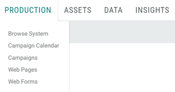
Main Menu: This is comprised of 4 main menu items that are most commonly used: Production, Assets, Data, and Insights. These menu items are the primary navigation component. To use the System Tray, hover your mouse cursor over one of the menu items at the top of the screen. Each main menu item represents the high-level groupings within Engage + called Main Categories. When you hover-over one of these, a pop-up menu is displayed, showing a list of specific features contained within that Main Category. These features are further organized into Sub-Categories. Production and its features are shown below as an example:
-
Workspace: This component is typically where you will create, edit, and manage the various items within Engage+. When you select a specific screen or feature, the Workspace is refreshed to show the content for that feature.
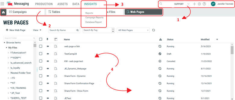
Once you've selected an item, the Workspace is again refreshed to show the details of that item, and to display the various commands and actions specific to that item. You'll also notice that a new tab gets added to the Top Navigation Pane. This tab allows you to quickly return to a previously-selected item.
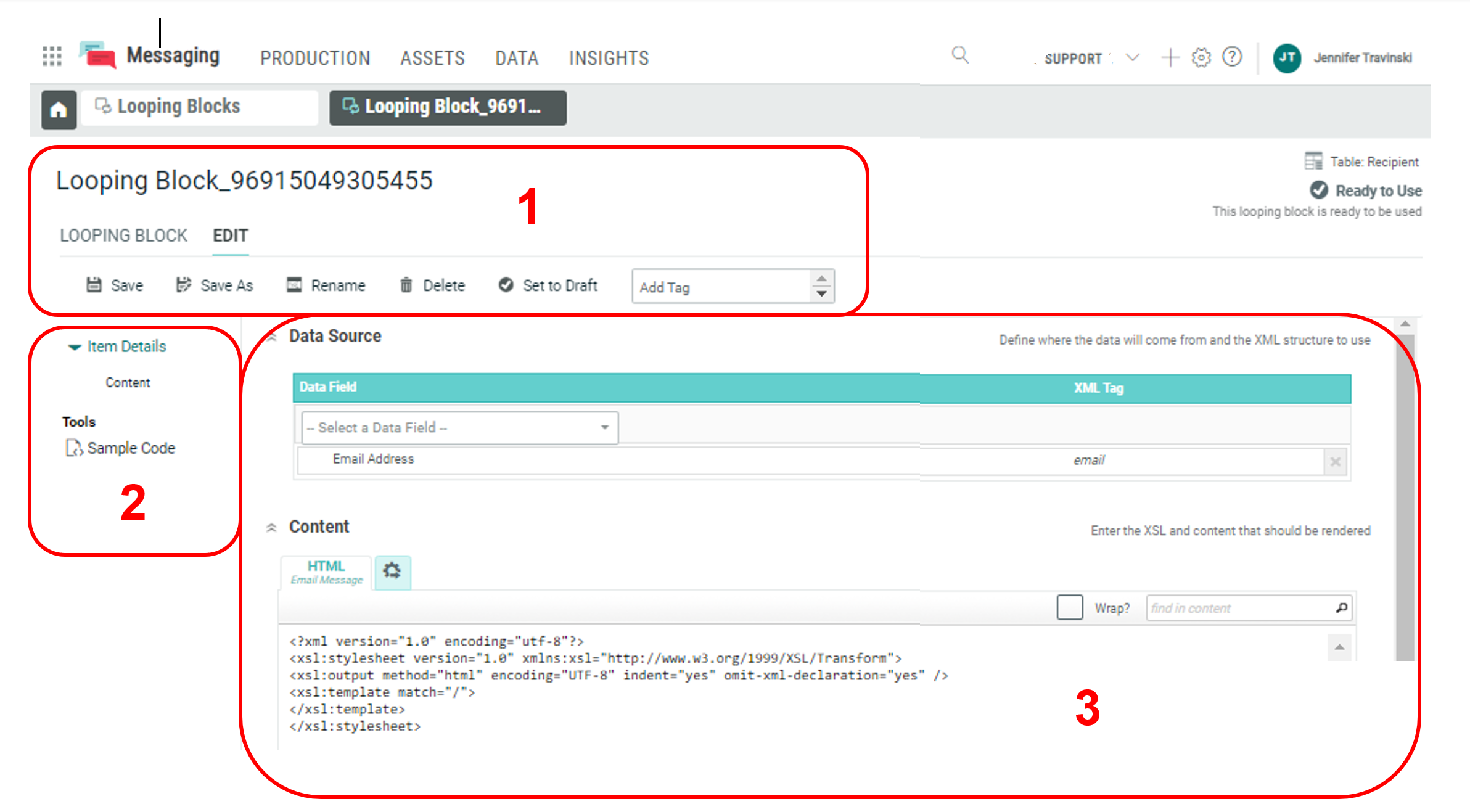
When working with an item, the Workspace is divided into the following components:
-
Tool Ribbon: This component provides access to common actions and commands, organized into different tabs and buttons.
-
Function Menu: Some item types have multiple functions available to them. The Function Menu displays a list of all the item-specific functions. Additionally, tabs are added as you open them, allowing you to quickly return to those items, or to move between items.
-
Item Details: This component displays the details of the selected item.
-
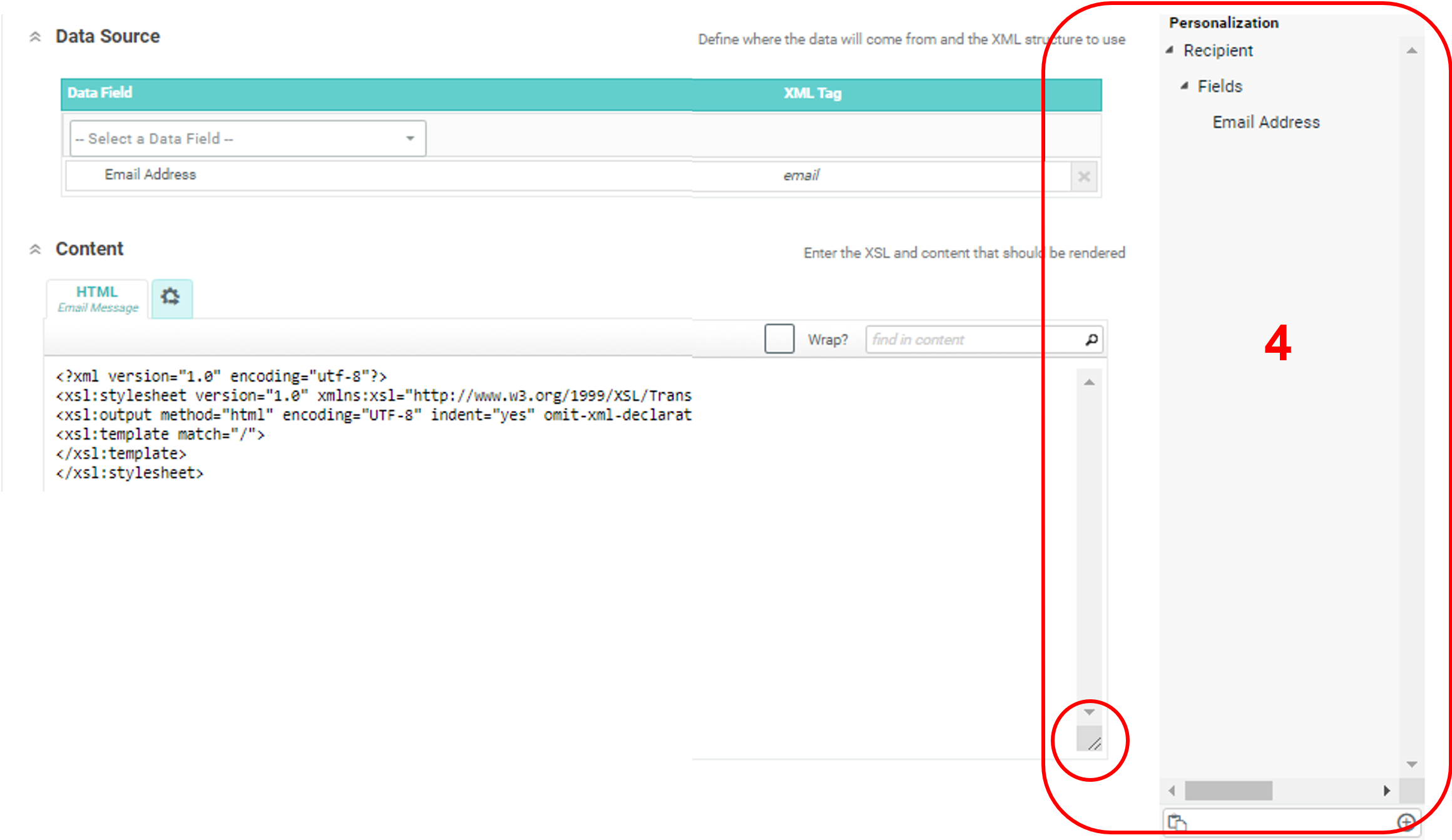
Dynamic Pane: Depending on the type of item that you're working on, an additional pane may be displayed along the right-hand side of the screen. The Dynamic Pane provides quick access to tools or commands specific to the item type. For example, when working with a Filter item, the "Expressions Toolbox" is displayed, which gives you access to various tools needed to build the filter. A "Personalization Pane" appears when you click on the button on the bottom-right corner of the item details screen. There you can select the fields you want to use to personalize your message.
Campaign Pages - Toolbar and Workflow
In Campaign pages, the toolbar has the following options: Settings, Preview, More Actions, and Save. Workflow buttons are displayed directly beneath the campaign name, as tabs: Setup, Content, Review, and Status.

Remaining Object Pages - Toolbar
Where there are more than 5 menu items, then those items get collapsed into a drop-down under “Actions”.
